Introduction
ggplot2 is a powerful and a flexible R package, implemented by Hadley Wickham, for producing elegant graphics.
The concept behind ggplot2 divides plot into three different fundamental parts: Plot = data + Aesthetics + Geometry.
The principal components of every plot can be defined as follow:
- data is a data frame
- Aesthetics is used to indicate x and y variables. It can also be used to control the color, the size or the shape of points, the height of bars, etc…..
- Geometry defines the type of graphics (histogram, box plot, line plot, density plot, dot plot, ….)
There are two major functions in ggplot2 package: qplot() and ggplot() functions.
- qplot() stands for quick plot, which can be used to produce easily simple plots.
- ggplot() function is more flexible and robust than qplot for building a plot piece by piece.
This document provides R course material for producing different types of plots using ggplot2.
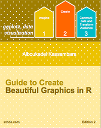
If you want be highly effective, download our book: Guide to Create Beautiful Graphics in R
Install and load ggplot2 package
# Installation
install.packages('ggplot2')

# Loading
library(ggplot2)
Data format and preparation
The data should be a data.frame (columns are variables and rows are observations).
The data set mtcars is used in the examples below:
# Load the data
data(mtcars)
df <- mtcars[, c("mpg", "cyl", "wt")]
head(df)
## mpg cyl wt
## Mazda RX4 21.0 6 2.620
## Mazda RX4 Wag 21.0 6 2.875
## Datsun 710 22.8 4 2.320
## Hornet 4 Drive 21.4 6 3.215
## Hornet Sportabout 18.7 8 3.440
## Valiant 18.1 6 3.460Plotting with ggplot2
- qplot(): Quick plot with ggplot2
- Scatter plots
- Bar plot
- Box plot, violin plot and dot plot
- Histogram and density plots
- Box plots
- Basic box plots
- Box plot with dots
- Change box plot colors by groups
- Change box plot line colors
- Change box plot fill colors
- Change the legend position
- Change the order of items in the legend
- Box plot with multiple groups
- Functions: geom_boxplot(), stat_boxplot(), stat_summary()

- Violin plots
- Basic violin plots
- Add summary statistics on a violin plot
- Add mean and median points
- Add median and quartile
- Add mean and standard deviation
- Violin plot with dots
- Change violin plot colors by groups
- Change violin plot line colors
- Change violin plot fill colors
- Change the legend position
- Change the order of items in the legend
- Violin plot with multiple groups
- Functions: geom_violin(), stat_ydensity()

- Dot plots
- Basic dot plots
- Add summary statistics on a dot plot
- Add mean and median points
- Dot plot with box plot and violin plot
- Add mean and standard deviation
- Change dot plot colors by groups
- Change the legend position
- Change the order of items in the legend
- Dot plot with multiple groups
- Functions: geom_dotplot()

- Stripcharts
- Basic stripcharts
- Add summary statistics on a stripchart
- Add mean and median points
- Stripchart with box blot and violin plot
- Add mean and standard deviation
- Change point shapes by groups
- Change stripchart colors by groups
- Change the legend position
- Change the order of items in the legend
- Stripchart with multiple groups
- Functions: geom_jitter(), stat_summary()

- Density plots
- Basic density plots
- Change density plot line types and colors
- Change density plot colors by groups
- Calculate the mean of each group :
- Change line colors
- Change fill colors
- Change the legend position
- Combine histogram and density plots
- Use facets
- Functions: geom_density(), stat_density()

- Histogram plots
- Basic histogram plots
- Add mean line and density plot on the histogram
- Change histogram plot line types and colors
- Change histogram plot colors by groups
- Calculate the mean of each group
- Change line colors
- Change fill colors
- Change the legend position
- Use facets
- Functions: geom_histogram(), stat_bin(), position_identity(), position_stack(), position_dodge().

- Scatter plots
- Basic scatter plots
- Label points in the scatter plot
- Add regression lines
- Change the appearance of points and lines
- Scatter plots with multiple groups
- Change the point color/shape/size automatically
- Add regression lines
- Change the point color/shape/size manually
- Add marginal rugs to a scatter plot
- Scatter plots with the 2d density estimation
- Scatter plots with ellipses
- Scatter plots with rectangular bins
- Scatter plot with marginal density distribution plot
- Functions: geom_point(), geom_smooth(), stat_smooth(), geom_rug(), geom_density_2d(), stat_density_2d(), stat_bin_2d(), geom_bin2d(), stat_summary_2d(), geom_hex() (see stat_bin_hex()), stat_summary_hex()

- Bar plots
- Basic bar plots
- Bar plot with labels
- Bar plot of counts
- Change bar plot colors by groups
- Change outline colors
- Change fill colors
- Change the legend position
- Change the order of items in the legend
- Bar plot with multiple groups
- Bar plot with a numeric x-axis
- Bar plot with error bars
- Functions: geom_bar(), geom_errorbar()
- Basic bar plots

- Line plots
- Line types in R
- Basic line plots
- Line plot with multiple groups
- Change globally the appearance of lines
- Change automatically the line types by groups
- Change manually the appearance of lines
- Functions: geom_line(), geom_step(), geom_path(), geom_errorbar()

- Error bars
- Add error bars to a bar and line plots
- Bar plot with error bars
- Line plot with error bars
- Dot plot with mean point and error bars
- Functions: geom_errorbarh(), geom_errorbar(), geom_linerange(), geom_pointrange(), geom_crossbar(), stat_summary()
- Add error bars to a bar and line plots
- Pie chart
- Simple pie charts
- Change the pie chart fill colors
- Create a pie chart from a factor variable
- Functions: coord_polar()

- QQ plots
- Basic qq plots
- Change qq plot point shapes by groups
- Change qq plot colors by groups
- Change the legend position
- Functions: stat_qq()


- ggsave(): Save a ggplot
- print(): print a ggplot to a file
- ggsave: save the last ggplot
- Functions: print(), ggsave()
Graphical parameters
- Main title, axis labels and legend title
- Change the main title and axis labels
- Change the appearance of the main title and axis labels
- Remove x and y axis labels
- Functions: labs(), ggtitle(), xlab(), ylab(), update_labels()

- Legend position and appearance
- Change the legend position
- Change the legend title and text font styles
- Change the background color of the legend box
- Change the order of legend items
- Remove the plot legend
- Remove slashes in the legend of a bar plot
- guides() : set or remove the legend for a specific aesthetic
- Functions: guides(), guide_legend(), guide_colourbar()

- Change colors automatically and manually
- Use a single color
- Change colors by groups
- Default colors
- Change colors manually
- Use RColorBrewer palettes
- Use Wes Anderson color palettes
- Use gray colors
- Continuous colors: Gradient colors
- Functions:
- Brewer palettes: scale_colour_brewer(), scale_fill_brewer(), scale_color_brewer()
- Gray scales: scale_color_grey(), scale_fill_grey()
- Manual colors: scale_color_manual(), scale_fill_manual()
- Hue colors: scale_colour_hue()
- Gradient, continuous colors: scale_color_gradient(), scale_fill_gradient(), scale_fill_continuous(), scale_color_continuous()
- Gradient, diverging colors: scale_color_gradient2(), scale_fill_gradient2(), scale_colour_gradientn()

- Point shapes, colors and size
- Change the point shapes, colors and sizes automatically
- Change point shapes, colors and sizes manually
- Functions: scale_shape_manual(), scale_color_manual(), scale_size_manual()
Points shapes available in R:


- Add text annotations to a graph
- Text annotations using the function geom_text
- Change the text color and size by groups
- Add a text annotation at a particular coordinate
- annotation_custom : Add a static text annotation in the top-right, top-left, …
- Functions: geom_text(), annotate(), annotation_custom()

- Line types
- Line types in R
- Basic line plots
- Line plot with multiple groups
- Change globally the appearance of lines
- Change automatically the line types by groups
- Change manually the appearance of lines
- Functions: scale_linetype(), scale_linetype_manual(), scale_color_manual(), scale_size_manual()

- Themes and background colors
- Quick functions to change plot themes
- Customize the appearance of the plot background
- Change the colors of the plot panel background and the grid lines
- Remove plot panel borders and grid lines
- Change the plot background color (not the panel)
- Use a custom theme
- theme_tufte : a minimalist theme
- theme_economist : theme based on the plots in the economist magazine
- theme_stata: theme based on Stata graph schemes.
- theme_wsj: theme based on plots in the Wall Street Journal
- theme_calc : theme based on LibreOffice Calc
- theme_hc : theme based on Highcharts JS
- Functions: theme(), theme_bw(), theme_grey(), theme_update(), theme_blank(), theme_classic(), theme_minimal(), theme_void(), theme_dark(), element_blank(), element_line(), element_rect(), element_text(), rel()


- Axis scales and transformations
- Change x and y axis limits
- Use xlim() and ylim() functions
- Use expand_limts() function
- Use scale_xx() functions
- Axis transformations
- Log and sqrt transformations
- Format axis tick mark labels
- Display log tick marks
- Format date axes
- Plot with dates
- Format axis tick mark labels
- Date axis limits
- Functions:
- xlim(), ylim(), expand_limits() : x, y axis limits
- scale_x_continuous(), scale_y_continuous()
- scale_x_log10(), scale_y_log10(): log10 transformation
- scale_x_sqrt(), scale_y_sqrt(): sqrt transformation
- coord_trans()
- scale_x_reverse(), scale_y_reverse()
- annotation_logticks()
- scale_x_date(), scale_y_date()
- scale_x_datetime(), scale_y_datetime()
- Change x and y axis limits

- Axis ticks: customize tick marks and labels, reorder and select items
- Change the appearance of the axis tick mark labels
- Hide x and y axis tick mark labels
- Change axis lines
- Set axis ticks for discrete and continuous axes
- Customize a discrete axis
- Change the order of items
- Change tick mark labels
- Choose which items to display
- Customize a continuous axis
- Set the position of tick marks
- Format the text of tick mark labels
- Customize a discrete axis
- Functions: theme(), scale_x_discrete(), scale_y_discrete(), scale_x_continuous(), scale_y_continuous()

- Add straight lines to a plot: horizontal, vertical and regression lines
- geom_hline : Add horizontal lines
- geom_vline : Add vertical lines
- geom_abline : Add regression lines
- geom_segment : Add a line segment
- Functions: geom_hline(), geom_vline(), geom_abline(), geom_segment()


- Rotate a plot: flip and reverse
- Horizontal plot : coord_flip()
- Reverse y axis
- Functions: coord_flip(), scale_x_reverse(), scale_y_reverse()


- Faceting: split a plot into a matrix of panels
- Facet with one variable
- Facet with two variables
- Facet scales
- Facet labels
- facet_wrap
- Functions: facet_grid(), facet_wrap(), label_both(), label_bquote(), label_parsed()

Extensions to ggplot2: R packages and functions
factoextra - Extract and Visualize the outputs of a multivariate analysis: PCA (Principal Component Analysis), CA (Correspondence Analysis), MCA (Multiple Correspondence Analysis) and clustering analyses.
easyggplot2: Perform and customize easily a plot with ggplot2: box plot, dot plot, strip chart, violin plot, histogram, density plot, scatter plot, bar plot, line plot, etc, …
ggplot2: Correlation matrix heatmap. Functions: geom_raster() and geom_tile()
ggfortify: Allow ggplot2 to handle some popular R packages. These include plotting 1) Matrix; 2) Linear Model and Generalized Linear Model; 3) Time Series; 4) PCA/Clustering; 5) Survival Curve; 6) Probability distribution
GGally: GGally extends ggplot2 for visualizing correlation matrix, scatterplot plot matrix, survival plot and more.
ggRandomForests: Graphical analysis of random forests with the randomForestSRC and ggplot2 packages.
ggdendro: Create dendrograms and tree diagrams using ggplot2
ggmcmc: Tools for Analyzing MCMC Simulations from Bayesian Inference
Ressources to improve your ggplot2 skills
Acknowledgment
- Thanks to Hadley Wickham for ggplot2 package: ggplot2 online documentation
- Thanks to RStudio for ggplot2 cheatseet
Infos
This analysis was performed using R (ver. 3.2.4) and ggplot2 (ver 2.1.0).